In this video for Redlight - Get Out My Head, I really like the beginning and how the clips change quickly on the beat of the music. I also like how to clips change from black and white to colour and also different tones of colours. I hope that we can use this effect within our promo music video during the editing stage.
Monday, 30 January 2012
Redlight - Get Out My Head
In this video for Redlight - Get Out My Head, I really like the beginning and how the clips change quickly on the beat of the music. I also like how to clips change from black and white to colour and also different tones of colours. I hope that we can use this effect within our promo music video during the editing stage.
Sunday, 29 January 2012
Sub Focus - Falling Down
This video by Sub Focus for their latest song "Falling Down" illustrates a few ideas we have been thinking about using. It includes festival shots and performance DJ shots. We are hoping to gather some festival footage from our own experiences and festivals and maybe stage our own DJ table to look like we are actually performing the song.
DJ Fresh Ft Rita Ora - Hot Right Now
In this video (DJ Fresh - Hot Right Now ft Rita Ora), I really like the urban feel of the video. It contains elements we wish to include in our music video like the grafitti, strong female lead character and the industrial location.
Thursday, 19 January 2012
FINAL DIGIPAK
FRONT COVER -
For the front cover of my digipak I used a printscreen from the footage we collected on our filming day recently. I chose this particular shot as I really liked the colours and composition. The plain and bold colours I believe fit our genre of alternative/indie and I thought the framing of the picture was accidently really good! I also used a simple font as again, I believe this complies with the conventions of digipaks within our genre.
I came up with the album name "TRAFFIC" by listing words that I associated with the word "noise". I was torn between noise pollution and noise traffic but finally decided that "traffic" fitted more with the genre of our DJ trio. I made my own parental advisory sticker as I believe that our band would create music of an explicit content. I also followed the conventions of digipak covers by including "Featuring the number one single "dreams"" as a selling point for the album.
LEFT INSIDE -
For the inside left of my digipak I again used a fantastically framed screenshot from our footage. I believe this photo was inkeeping with our genre and I also tied this in with the magazine quotes and reviews I included. I used magazines that I thought we be interested in and would advertise a band like "Hunt The Noise" like Kerrang! and NME.
RIGHT INSIDE/CD -
For the inside right and CD of my digipak I thought it was important to keep it simple. I used a plain brick wall for the backgroud, again from our footage, that was appropriate to our genre keeping the urban feel we wanted to achieve. I then used Adobe Photoshop and the transparency tool to create a CD with a different image. I used another screenshot that fitted well.
BACK COVER -
For the back of my digipak, I used black and white shot from our footage. I thought this really captured the urban/alternative feel to our music video and also think the single chair alone represents the lone girl in our video. I chose the song titles through discussion with a friend and she managed to get her name in their!! (Martelli's Song). I also followed the conventions of a digipak by creating a barcode, production, distribution and printing company.
For the back of my digipak, I used black and white shot from our footage. I thought this really captured the urban/alternative feel to our music video and also think the single chair alone represents the lone girl in our video. I chose the song titles through discussion with a friend and she managed to get her name in their!! (Martelli's Song). I also followed the conventions of a digipak by creating a barcode, production, distribution and printing company.
Wednesday, 18 January 2012
Possible Front Covers for Digipak and Audience Feedback
On my Facebook account I created an album called "media help" where I uploaded six possible album covers for people to comment and "like" the cover they thought were best.
Tuesday, 17 January 2012
Pictures for Digipak
Here are all the pictures I am considering using for my Digipak. Im now going to edit them and make my Digipak deciding on which ones to use.
Sunday, 15 January 2012
Digipak/Band Logo
I found this picture on http://www.weheartit.com/ and I really like that the words fit in one box and the letters are spaced differently to fit to this. I am going to try this for the logo of Hunt The Noise on my digipak cover.
Friday, 13 January 2012
Ageing of the footage
Here is Lana Del Rey's video to "Blue Jeans". We really like the "aged" clips in the video and also the random shots that kind of have no meaning?
We're playing around with iMovie now.
We also experimenting with the "muted colours" I spoke about before.
Here is a video we created.
Here is a video we created.
Digipak/Costume
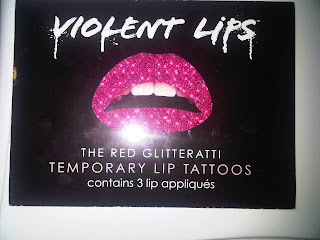
For our Digipak, I'm planning to use a picture of Lana with headphones round her neck and just from her nose down. I got these lip transfers which will give her an all glitter lip and with the headphones it will combine the female and DJ element. I also thought that my bedroom wallpaper would be good to use however I'm not 100% so I will also try it with a black background.
Thursday, 12 January 2012
Japanese Popstars & Cher Lloyd
Lana and I were searching Virgin Media for new music videos and we came across this video by Japanese Popstars.
It keeps happening!!!!
We keep finding videos with things in that we wanted to do, but I guess that just gives us and insight into the music video industry.
Here is what we collected.
It's also happened with Cher Lloyds new video "Want You Back". We filmed our friend Georgia in a bath tub with balloons and Cher Lloyd has now done the same thing.
Here is what we collected.
It's also happened with Cher Lloyds new video "Want You Back". We filmed our friend Georgia in a bath tub with balloons and Cher Lloyd has now done the same thing.
Wednesday, 11 January 2012
Title of Band/Song
Looking at the music video for "Futures - Start A Fire" we really liked the fact that the song title and band appear at the beginning of the music video.
Friday, 6 January 2012
Filming
Here are some pictures I took whilst we were out filming on Friday
These are the flats in Ponders End that we managed to get some really good shots of that we're proud of. I will upload a video further down this post.
The colours of flats looked amazing but also looked quite gritty which we loved. Luckily we also had really good weather and the sky and sun looked really professional.
Here are Lana and Yasemin filming
We also drove to Cuffley to the apparent "highest point in England". We managed to get some really cool scenery shots with the sun which provided really good lighting however we're not 100% sure if it fits with our music video so we are going to try it and see if it works.

Here is the video we created with all our footage from todays filming
We also filmed about two weeks prior to this, just some little shots involving a lot of balloons and a bath tub.
Here is a still of the "set" and then a video follows of the footage we have gathered.
The only problem with this footage is that its a bit dark however if we use as a small "flash" shot, it shouldn't look too bad.
All the pictures and videos on this post are primary sources.
All the pictures and videos on this post are primary sources.
Wednesday, 4 January 2012
Tuesday, 3 January 2012
JME - 96 F**KRIES
In JME's new video he uses the camera technique/equipment we learnt about in AS - the SnorriCam. It would be really effective if we could use this in our music video and would look original.
I also really like JME's use of his twitter account. He constantly replies to fans and uses it to promote his up and coming singles, albums and videos. Moreover, the UK Grime artist promotes other artists work as they are all under the group "BBK" (Boy Better Know) - established by JME himself - who now run their own record label which features a huge amount of UK Grime artists.
Monday, 2 January 2012
Lana Del Rey - Born To Die
Not sure how to link this too our music video but LANA DEL REY IS SO BEAUTIFUL. :(
Serious side: the shocking element at the end, of what I assume is her boyfriend, killing her is quite similiar to what we want to achieve in our coursework.
Subscribe to:
Comments (Atom)


